Sunday, August 25, 2013

Unlocking the VAULT: Why things go viral...

Making a positive viral communication is one of the holy grails of marketing and branding. Tonight, my blog post is a synthesis of some of the best academic and practitioner work on what drives virality.

Let's start off with some questions.
  • Why are some pictures re-Tweeted and others don't get a single chirp?
  • How come some articles are "most emailed stories" and others collect cyber dust moments after they are posted?
  • Why are some YouTube videos passed on?
  • What drives online virality?
Numa Numa Kid: >55 million views

Springer Family Vacation: 13 views
A good starting point to answer this question is this video. It's a Ted Talk by Google-Guy Kevin Allocca whose job is to follow trends on YouTube. He has some cool stats (e.g. in 2011, more than 2 days of content were added every minute to YouTube) and a great point of view on the things that drive virality. He says there are 3 things: tastemakers, communities of participation, and unexpectedness. While Allocca is focusing on viral video to deliver his viral drivers, we're going to assume that his  framework also holds for images and articles. After all, videos, images and articles are doing the same thing: telling a story.

The starting point of any video, image, or article is the content itself, so let’s reorganize Allocca's framework into a more natural order:
  1. Unexpectedness - unexpected content
  2. Tastemakers - influencers who promote the content
  3. Communities of participation - content that people can join in the theme/message participate
It makes a lot of sense that tastemakers drive virality. A Tweet about “Call Me Maybe” from Justin and Selena got an army of teeny-boppers making Carly Rae’s video a top viewed within hours. Tosh's nod to Rebecca Black's Friday rocketed interest in her song. And, there can hardly be an argument that communities of participation enhance viral appeal too. Search "Harlem Shake" on You Tube you get more than 3,800,000 results. (Which doesn't say much for how people spend their time, if you ask me).  Participation enhances commitment to the original work and share appeal within social networks.
Harlem Shake: >3.8 million results
Harlem Shake Army: >92 million views
But now it’s time to dig a little deeper and make a challenge to Allocca’s framework.  It starts with a big, but reasonable assumption that the most watched videos have a viral component to them. I don't know share rates, but any video that has over 500,000,000 views has to have been passed along. With that assumption, check out the most popular videos on YouTube. Most of them are pop music videos with scripts out of a can. In other words, I'm arguing they do not score high on "unexpectedness".
Top 6 videos on YouTube:  Music out of a can?
Let’s look at the NY Times most emailed stories of today. Top shared articles are about how market fluctuations are just "a variant on the same old story", and how tablets can help kids learn to read. This is hardly unexpected content. It is also not unusual for the NY Times to carry these stories.

I decided to look for a better framework to answer tonight's questions, but to my surprise, there isn't a lot of meaty content out there. So I did what my academic training taught me to do - a lit review. I synthesized the best and current literature on word-of-mouth and online virality to unlock the vault of what goes viral. Not surprisingly, the starting point is the message.

Unlocking the V.A.U.L.T. of Virality

V. is for valence
The question related to valence is this: is a positive or negative piece of information more likely to be passed along?

Positive pass-along
The academic case for passing along positive news has been around since the 1950s. In 1958, Homans built the case that people like to pass along good news because it a social exchange value. This idea gets extended to this:  if I pass along some good information, my friends and acquaintances are happy- and I get associated to the news. So, if I pass along positive news to someone, it makes me look good and it bolsters my self-concept (Wojnicki and Godes 2008).

Negative pass-along
There is also a lot of evidence for a negativity bias (see: Bad is Stronger than Good by Baumeister, Bratslavski, Finkenauer, Vohs 2001). There is a prevailing attitude in the press that bad news sells and since negative info is more diagnostic and tends to be more useful for us we are more likely pass that along. Think about it: if there is a radiation leak in Japan that affects the Pacific salmon, you’ll want to share the news to your friends to keep them from harm. After all, it is better to be safe than sorry (Heath 1999).

So the answer is…
The reality is that people do pass along both positive and negative news. But both experiments and field data on the NY Times "most emailed stories" by Berger and Milman (2011) suggest there is a postivity bias. So if your intuition was that good news spreads better, you'd be right.

A is for activation
Activation relates to how emotionally charged up a person gets from the video/story/picture. There are lots of different emotions (some positive, some negative), but these emotions fire people up to varying degrees. Awe, amusement, anger and anxiety are examples of emotions where, when triggered, motivate people to share the news (Berger and Milman 2011). If the story content makes you content or sad, and  you’ll be a lot less willing to share the story. This explains Charlie Bit My Finger (high on the Awwwwwwe) and Kony (high on Anger)  got shared a lot. It also helps explain what drives people to share amusing ads like John West salmon and DAR pictures from the Chive.


Charlie: >540 million AWWWWEs
U is uniqueness
This one is pretty obvious. Would you rather pass on something everybody has seen or something creative. If information is novel or unique, it tends to be more interesting and shareworthy.

Level of Extreme
This one is more tricky. What is shared more: more extreme news or more moderate news? The case for both laid out below.

The case for extreme information
The Extremity theory posits that people pass on more extreme news. The justification is pretty simple:  extreme news (either good or bad) is more interesting (Heath 1999), more helpful for decision making (Skowronski and Carlston 1989), and that people are more likely to engage in word-of-mouth when they are extremely satisfied or dissatisfied (Anderson 1998). Beyond that, extremely good or bad emotionally charged info is often used to deepen social connection (Festinger, Riecken and Schachter 1956). Ask anyone who has experienced a trauma, and they tend to love sharing their story. Furthermore, if you are trying to raise money for your cause, or demonize your political opponent, there is incentive to exaggerate (Heath 1999).

The case for moderate information
The argument for propensity to pass along more moderate information is centered (pardon the pun) on the Centrality Theory.  This theory goes like this.   People are reluctant to pass on extreme news because the stories may be less believable (Grice 1975) and the news teller is concerned about how the receiver will thinks of him/her (Tecklock, Skitk, and Boettger 1989).

So the answer is…
There is a bias to pass over more moderate news (Heath 1999). There are exceptions to this of course. Extreme news will be passed on when it matches the emotional valence of the situation.

T is timeliness
This is pretty straightforward- timing matters. It’s no coincidence that Rebecca Black’s Friday song consistently spiked on Friday or that Santa images get passed along more at Christmas time.
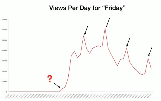
Rebecca Black's Friday spikes on Fridays (from TedTalk)

So we can now marry our VAULT literature review with You Tube’s structure to have a more thorough perspective on what drives virality:
  1. VAULT
  2. Tastemakers
  3. Communities of Pariticipation
So now we have a more thorough understanding of what drives virality:  we have unlocked the vault to what makes a video, article, or image go viral.

Tuesday, August 13, 2013

Brandscape: Canada's Brand Map

By request, here is a page with just the brandscape of Canada. You can read a more in depth explanation of the map here at MackalskionMarketing or at Integrated Brands' Canada's Iconic Brands. If you'd like to voice your opinion on what Canada's national brand is, voice it here. You can make the map larger with a click.


Thursday, August 8, 2013

Brand Map: The Branded Provinces (and Territories) of Canada


I love hearing from my former Brand Mangement students.

A few weeks ago, a one of them, Charlie, sent me a blog post that he came across: “The Corporate States of America”. He wrote,

“Bob, I hope your summer is going well. I was on my company’s internal branding page this morning, and I came across this posting which I thought was kind of fun! It’s not official in any way, but I want to believe the guy who made this put SOME thought into it. Then I realized I wouldn’t even know where to begin with making this map for Canada. Do the Territories even have brands??”

Well Charlie, this is your lucky day. Working with the team at Integrated Brands, we developed a distinctly Oh Canada map we call “The Canadian Brand Map: The Branded Provinces and Territories of Canada”.   But before we get there, let’s make a few observations on the American version.

The Corporate States of America
Lovelace, blogger and creator of the Corporate States of America used the following criteria: a brand that a) has ties to that state and b) is still in business.   


Some of his selections are controversial, as is evidenced by many the 295 comments at the end of the blog post. A quick study reveals that some heavy-weight brands like Disney, McDonalds, Exxon, KFC, and Microsoft have been shunned for Hooters, Caterpillar, Dr.Pepper, Lexmark and Starbucks in Florida, Illinois, Texas, Kentucky and Washington respectively. As the author readily admits, it’s a subjective map not a scientific one. But, these brands have real social and economic impact where they operate. Each brand represents thousands (sometimes hundreds of thousands) of reliable jobs, stable investments, and millions in tax revenues.

The Canadian Brand Map
For our Canadian Brand Map, we took a little different approach and  brand-mapped the key national and regional Canadian brands. And just like Lovelace, who struggled to find strong brands in certain regions in the USA, we struggled to find representing brands in parts of Canada. But in the end, our Canadian Brand Map showcases over 70 Canadian brands.


So what made the list? Brands that satisfied these criteria. 

1.       The brand needed its head office to be in a Canadian province/territory. As a result, Thompson-Reuters (which has deep Canadian roots) was cut because its head office sailed off to New York. Molson-Coors, on the other hand, made the map.

2.      The brand required a business-to-consumer orientation. So, heavy-industry brands like Resolute Forest Products and Potash Corp weren’t eligible. Some decisions got a little murkier so we teased out relevant sub-brands from the corporate parent. For example, we excluded the Bombardier brand (oriented towards planes and trains) but included their consumer-marketed sub-brands (e.g. Sea-Doo). CN also made the cut because of its ongoing branding related to consumers (e.g. CN Tower).

3.       The brand needed significant brand awareness nationally, regionally, or both- and be in the collective consciousness of the region. Obviously, this has subjectivity to it- but talking about the blog post to residents of various provinces and territories returned the same brands over and over. In a way this was a quick-and-dirty awareness recall test.  Our final list also passed the sniff-test of a team of a 5 Canadian branding/advertising professionals and marketing professors.

4.       The brand required distribution of goods/services beyond that of its home province/territory.

Certain brands including non-profits (e.g. RCMP,World Vision Canada, War Amps etc),media brands (e.g. CTV, Globe and Mail, National Post, TSN, Much Music, Shaw, Videotron etc.), sports brands (e.g. CFL, Edmonton Oilers, Winnipeg Jets, Toronto Maple Leafs etc), and universities (e.g. UBC, Brandon University, Dalhousie University, University of Western Ontario etc.) were excluded from presentation to keep the map cleaner. The one exception was the CBC, given its iconic standing in Canadian heritage.

When all the brands are plotted on a map like this, there are lots of insights to be had. There’s the “ohhhh I didn’t know that brand was a Canadian brand.” I’d be curious to know what percentage of the population knew that Sabian Symbols or Harlequin Romance stories were brand babies from north of the 49th parallel.

The map also tells a richer story about regional values. Take a look at the Brand Map again. The brands tend to reflect the values of the regions that they come from.  British Columbia is stereotypically Canada’s balanced-lifestyle, rugged environmental, and hippy meets granola province. Not surprisingly, then it homes one of the world’s premiere well-being brands (Lululemon) and two of Canada’s rugged outdoorsy nature brands (Arc’teryx, Mountain Equipment Co-Op).   

At the other end of the country, the province of Quebec inherited a lot of associations from its parent country (France). France’s  imagery relates to hedonic pleasures. The French are synonymous with good times rather than work. Passionate l’amour, fashion and fine alcohols are staples in stereotype Frenchland. It make sense then, that Canada’s sexiest brand (La Senza), major cheese player (Saputo),and “good times” recreational brands Sea Doo, Ski Doo, Just for Laughs, Cirque du Soleil, and Seagrams come from la belle province. 

Let’s  shift to Saskatchewan. Saskatchewan is Canada’s collectivist province. It is the birthplace of Medicare in Canada and housed the first openly socialist regional government in Canada. No surprise here that the values spawn coop organizations. 

There is one final point I’d like to make before signing off today. While the brands draw values from the region, they also give back. As the thousands of Canadians (sometimes tens of thousands) who work for these brands have reliable jobs, they are being inundated with the values of the brand on a daily basis. As the brand expands, so too do the ideals from the brand.  You might say, Canada’s gotten a little more "well-being" thanks to Lulu’s out there- and is a little more connected thanks to Air Canada’s and Tim’s.