Tuesday, December 4, 2012

The Kitty that Roars with Licensing Gusto

by Felicia Sominglai

Which characters are the kings and queens of licensing? Seriously, take a minute to think about it and make some guesses.

Your intuition might lead you to Mickey Mouse, or to Winnie the Pooh, or to superheros like Spiderman or IronMan, or maybe to Pixar characters like Nemo and Lightning McQueen. What about Star Wars? If your intuition leads you to these characters, you’d be right. (Incidentally, every single one of these properties (Disney traditional, Pixar stable,Winnie the Pooh, Marvel, and Lucas Films) are all under the Disney domain. And, according to work done by the Licensing Letter, the top three properties  for licensing in Canada and the USA come from the Disney Princesses, Star Wars, and Pooh. Each of these properties is worth well over a billion a year in revenue and taken together, they account for almost a third of all character licensed revenues in Canada and the USA.  

But there is one other property that needs special attention. Move over Princesses, there is a Kitty that is world-wide licensing royalty.


Hello Kitty is a fictional kitty character comic created by Sanrio Inc. The famous kitty made her first appearance in Japan on a vinyl coin purse in 1974. Three years later, she was introduced in the United States. Sanrio initially was targeting pre-adolescent females, but Hello Kitty caught on with teenagers and adult consumers as well. It is now one of the "powerhouse" characters in North America (see below) and with its strength in populous Asia, it vies for world-wide cartoon popularity supremacy.

Given the comic's look and feel, it seems obvious that Hello Kitty character  would end up as dolls, stickers, greeting cards, clothes, accessories, school supplies and purses. But what is surprising is that Hello Kitty appears licensed on toasters, televisions, home appliances, massagers, hard rockin Stratocaster guitars, wines, high end gemstones,and computer equipment. It is even less obvious (and more surprising) that Hello Kitty has been licensed out to rare collectibles and an airline. Yes, that’s right, an airline!

EVA Airways, a Taiwanese airline company, has brought brand licensing to a whole different level.  Originally launched in 2005, the totally Hello-Kitty themed fleet has recently grown to 5.(EVA added 2 more to its fleet in the last few months). Just how Hello-Kitty themed is the Hello Kitty airline service?  It's 100% Hello Kitty integration. Every consumer touch-point has been Kittied-up: the plane, the luggage machines, the ticket counters, the in-flight design, the boarding passes, the flight attendant uniforms, and the food. These images speak for themselves.
Even airport in Taipei was even redesigned in order to fit the theme.
The luggage handlers drive Hello Kitty equipment
Hello Kitty, pillows and head rests
In-flight service Kitty-style!


According the EVA, the Hello Kitty themed air service has been a huge success since launched. According to the Evergreen Group, the parent company of EVA Airways, all the Hello Kitty jets have occupied over 85 to 90 percent per flight, well above industry averages.  Try the experience online yourself: http://evakitty.evaair.com/en/pages/experience/lineplane.aspx 

 __________________________________________________________________________

TOP 10 LICENSED ENTERTAINMENT/CHARACTER PROPERTIESU.S. AND CANADA, 2010

1.                  Disney Princess -- Disney -- $1,725 million

2.                  Star Wars & The Clone Wars -- LucasFilm -- $1,415 million

3.                  Pooh -- Disney -- $1,100 million

4.                  Toy Story -- Disney/Pixar -- $915 million

5.                  Cars -- Disney/Pixar -- $810 million

6.                  Hello Kitty -- Sanrio -- $750 million

7.                  Mickey & Friends -- Disney -- $725 million

8.                  Peanuts -- Peanuts Worldwide/Iconix -- $660 million

9.                  Sesame Street  -- Sesame Workshop -- $525 million

10.                WWE -- WWE -- $520 million

Monday, December 3, 2012

Why I Like "the Like"

by Shirley Pechthold


A recent study was conducted by Napkin Labs (a Facebook app developer) to measure the effectiveness of a brand’s Facebook page. Through an investigation of over 50 brand Facebook pages, the study concluded that only6% of the people who “liked” the page actually interacted with it (in terms of likes shares and comments). Furthermore, the study concluded that the interaction of the majority of the 6% was only once every eight weeks. Napkin Labs assessed that brands need to focus more on maintaining their relationships with “superfans” who interacted much more than the average. They also suggest that brands should focus less on achieving a high number of likes for their page, and focus more on creating more likes and comments by the already existing fans.

I think that that the conclusions of this study are important. After all, marketers have long known to focus on the most valuable customers. Yet, this study seems to be missing a critical component of a "like" and its relation to a Facebook brand page. 

Awareness building is expensive
Of course, it's true that a brand that has built a Facebook page is using that social community page to build relationships. That being said, the value of a Facebook page is not only to stimulate a track-able response via likes and comments (i.e. the outcomes of a relationship), but also stimulates awareness of the brand. By being "liked", the brand's identity is exposed to other Facebook users. Suggesting that there is no value to this exposure, is like saying there is no value to a brand logo being displayed on the boards at a hockey game. Yet, the market indicates that this exposure is worth a lot of money. Exposure of a logo on 8 feet of boards of the blind-side (non-camera side) of an NHL game is about $30,000 for the regular season home games.

But wait- there's something else too. When someone likes a brand’s Facebook page, news and updates are presented on their newsfeed from the brand. For me personally, I liked on Facebook a lot of clothing brands. When I open my own Facebook page, I get to see the brand's new products and hear firsthand about the brand's promotions. Often, these links will lead me outside of the Facebook environment to the brand's website (where I have made purchases). Other times, however, I will be linked to the brand's Facebook page (where I have made purchases). I assume that the brand can track how many clicks were generated off of this news update, and in turn measure how many purchases were made. But the research presented done by Napkin Labs zeros in on the Facebook environment.

The conclusion that I am drawing is this: Marketers ought to "Like" a  Facebook "Like" a lot more than Napkin Labs would have them believe!

Wednesday, November 28, 2012

Making the Old Brand Young: Topshop Revitalizes The Bay

Every year, I invite my Brand Management students to write a guest blog entry. Today, I'll post the first of a few. Enjoy!

Making the Old Brand Young - Topshop Revitalizes The Bay
by Rosalie Beaudoin


When I heard a Topshop boutique was coming to Canada, I jumped for joy. I love the brand.

For those unfamiliar with Topshop, it is a British retailer that has 440 shops in 33 different countries selling relatively inexpensive fashion-forward clothes and accessories to women (It also sells under the name Topman  for men, but let’s be honest, women’s fashion is more interesting!).  The target market for Topshop is a young 15 to 30 year old woman who like to wear trendy/hip and make-a-statement clothes and go out on the town.

What makes Topshop brand so interesting to me is it distinctive style and highly differentiated product line.  If you are not familiar with the “look and feel of the brand”, these product line names will help give you a flavour for what I am talking about:
Psychadelic Dandy, Holiday Sparkle, Rock-oco, and Galactica

A little Holiday Sparkle
As these product line names suggest, Topshop is bold, a little bit edgy, and lets the wearer make a shimmering statement when she goes out. The store and the shopping experience reinforce these notions.
Topshop products have been accessible to Canadians, but only via the online store. Of course, it is tricky to shop for clothing online. There are issues with fit (not being able to try it on) and delivery charges -  which are not applicable to the in-store shopping experience. That, however, changed very recently.

Bonnie Brooks, president and CEO of The Bay, is the one to thank for bringing the Topshop store  (and Topman), from Britain to Canada. The Bay was acquired exclusive Canadian franchise rights.  Yet, this raised a bigger branding question. From a branding point of view, was this a good move for The Bay?

When I heard that the Bay was going to be launching Topshop within their store, I started thinking, do these two brands jive? To me the typical The Bay shopper was an old couple shopping for wool shirts. I wanted to see if my attitude towards The Bay was consistent with others in my segment.  So, I did a quick-and-dirty brand image investigation of The Bay using some classic brand image free association tests. My sample were all Topshop target market consumers.  Here's what I found. Their perceptions were highly consistent with mine: The Bay is  “a dusty, stagnant, and old” brand”. The Bay "is not for me".  In short, The Bay has a relevancy problem among Topshop consumers.

Rock and Shimmer: Topshop
Because of my love for Topshop, I still had to check out the line. So I took the leap and went to The Bay to see the Topshop line after not entering the store for many years. When shopping, however, I realized that the brands The Bay had were more interesting and fashionable than I thought they were. Topshop lured me into see a cornucopia of  brands that are exciting, youthful, and fun- not the dusty, stagnant, and old brands that senior citizens would be wearing. My visit made me change my opinion of The Bay’s brand. It seems that Brooks' strategy for The Bay’s strategy has been  to update The Bay by leveraging the brand equity from the brands that it carries.

The Competitive Collision
So what does this mean? First, The Bay’s image is being revitalized through the brands it carries. That's a win for the Bay, so long as it can lure the desired segments in. Second, Topshop’s image  is not going to be tarnished because it is carried in a revitalized Bay store.  Third, the competitive landscape is on a collision course for this target market. The "old" Bay is becoming more competitive with younger consumers who shop at other places like  Zara and H&M.  Then, in 2013, Target enters the space with 125 additional stores.

As a marketer, it is going to be fun watching these brands collide and compete for young women. But, with more choice, it is also going to a lot more fun for this segment to shop!

Sunday, October 28, 2012

I'm a Brand this Halloween!

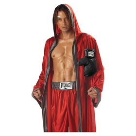
What do Heniz, Everlast, Munchen Ramen, Crayola,  Hershey's Kisses, and Frosted Flakes have in common?

a) They are all iconic brands.
b) They have a high ratio of lovers to haters on Brand Mojo.
c) They all are corporate brands that have Halloween costumes available for sale.
d) All of the above.

The answer, is "d", all of the above.  As we gear up to celebrate Halloween, I thought it would be fun to celebrate some of the best selling Halloween costumes that feature corporate brands. These are Halloween costumes that people buy and wear, to be their favorite brand on one of the most fun nights of the year! Now that's brand love!


Who needs Halloween candy when you are Campbell's Chunky and Munchen Ramen?

mmm...M&Ms
Playing Hefner's brand

Squeeze me:  Heinz Ketchup
Battle of the burger brands: Burger King and McD's Hamburglar 
Tootsie Roll

Ho Ho Ho... they're grrrreat: characters Halloween costumes - The Green Giant and Tony the Tiger

Thumbs up to Nerdy Nerds!
How about a kiss? Hershey's Kiss?

Color me cute with Crayola

A candy store!  Resse's, 3 Muskateers, and Starburst

The knock-out boxing brand- Everlast


Monday, October 8, 2012

Stories of Sight, Sound and Substance: Perspectives on Presidential Candidate Marketing

PREAMBLE:

Nothing is more raw in terms of branding and marketing than American presidential political campaigns. Candidates, and their respective parties, segment the voting market into fine-tuning micro segments, target the electorate based on tightly defined demographics, psychographics, and lifestyle, and brand themselves using every communications tool in the book. Things that would be illegal in the business world, like intentionally misleading facts or suppressing voters seem to be acceptable- if not expected- in the American presidential political world. With one month of campaigning remaining in this 2012 presidential election, presidential ad spending recently soared past $700 million, an amount that has already exceeded 2008's total. What makes this amount even more interesting is this: the percentage of American voters who are truly "up for grabs" is between 3-5% of voters (New York Times). So, if around 130,000,000 people vote in this year's election (2008 figures were 131,000,000), parties and their surrogates will be spending around $150 just on ads to target each swing voter, if you believe the New York Time's assertion. If that ain't marketing and branding at its rawest, I don't know what is.

I wish to underscore the notion that this blog, which is probably closer to an essay, focuses in on the marketing and branding side of presidential elections- not the politics of it. 

Stories of Sight, Sound and Substance: 
Perspectives on Presidential Candidate Marketing

Since TV, they say, sight matters most. 

On September 26th, 1960, Senator John F. Kennedy faced off (pun intended) against Vice President Richard M. Nixon in the first televised American presidential debate.  Those who heard the debate on radio thought Nixon was the victor. Those who saw the debate on TV, which was viewed by around 70 million Americans, thought Kennedy was the clear winner (1).  Another way of looking at it, in this first debate, Nixon had the substance and sound advantage.  Kennedy had the sight advantage. But at the end of the debate, the producer of the debate and founder of 60 Minutes Don Hewitt said , "When that [first] debate was over, I realized that we didn’t have to wait for an election day. We just elected a president. It all happened on television.(2)"  Here's how it happened.

Telegraph image: tanned Kennedy, producer Hewitt, and pale Nixon
The handsome Kennedy was a lot younger than Nixon.  Kennedy (and his handlers) understood the importance of the new television technology as an image building vehicle and communications tool. Kennedy prepped, rested up, and wore make-up. Nixon, on the other hand, didn't prep as much and  refused to wear makeup. The contrast on TV was stark. Kennedy "looked tan and fit...... a matinee idol,” while Nixon looked " like death warmed over" (Don Hewitt). Nixon looked pale, sweaty, and unhealthy. His grey suit probably didn’t help on the black and white television screens either. To Nixon’s defense, he had been in a pretty bad car accident before the debate- and the accident was severe enough to have him suspend campaigning for 2 weeks. To Kennedy's luck, he had been campaigning in California and captured more of a tan.  But TV cameras don’t tell that story. The “vision” of the television tube did what it is supposed to do- communicate with visual motions. In the end, Kennedy’s brand image was built by sight while Nixon’s was being destroyed by it. Visuals mattered more than what was being said, or how it was being said. Substance was beaten by sight.

This leads to the question- how much more does sight matter in image building than sound and substance in a presidential debate? Let's check out some evidence.


President Reagan, master of the 85-10-5 rule.
Mike Deaver was the management chief of President Reagan's image in the media. Deaver, who himself was involved in prepping Reagan for his presidential debate formulated a 85-10-5 heuristic. More specifically, a visual event -ie television or public event - is  85 percent sight (how you look), 10 percent sound (how you sound) and 5 percent substance (what you actually say) (3).The Gipper, probably better than any other president in modern history, had a natural advantage with the visual part, given his training as a Hollywood actor. Through non-verbals, Reagan could convey emotions and subtleties through his facial expressions and body language. He’d have the perfect mannerisms when he was expressing sympathy (e.g. when the Challenger blew up), comedy (e.g. “I will not make age an issue in this election"), or challenges (e.g. “Mr. Gorbachev, tear down this wall” speech). He was the visual master. His media team knew he could feign a tear or light up a room with his eyes.

Here’s another take on how much more powerful sight is over sound and substance. There's a story on Reagan that has circulated among many political marketers.  It was also reported in Brian Stewart's CBC documentary the Reagan Years. This story tells of a left-leaning reporter who wanted to dint conservative Reagan's popularity by doing an “exposé” on network prime-time. The reporter aired video footage of Ronald Reagan smiling broadly with a shovel breaking ground for a new school in a low income district with school-board members applauding. Then a voice-over provided a punch that Reagan's education cutbacks were  leading to problems in education. She’d show footage of Ronald Reagan , surrounded by smiling seniors, cutting a giant big ribbon with event-sized scissors for a new senior’s home while the voice-over would harshly criticize Reagan's senior citizen subsidization slash. She’d have video clips of an affable Reagan in jeans planting a tree with some tree planters while her voice-over would blast his environmental record. On and on the exposé went. And, immediately following the program, the reporter’s phone rang. It was the White House Press Secretary. And the reporter was prepared for her fate – never to be invited back to the White House for press conferences again.  According to the story (and Stewart's documentary) the transcript of the conversation went something like this:


Reporter: Did you see my 15 minute news segment tonight?
WHPS: Yeah. Thanks. It was terrific!
Reporter: What are you talking about???  Didn’t you hear what I said?
WHPS:  You don't get it. When the visuals are that good, nobody hears what you say!

Recent academic research also supports this notion that visuals matter more than what you say. Research exploring how much do appearances of politicians influence voters  was done by University of California Berkley political science professor Professor Lenz. His study with Chappell Lawson, Andy Baker, and Michael Myers went like this: Voters in the USA and India were shown real election matchup photos (think campaign sign images) from Brazilian and Mexican candidates. When asked which candidate would make a better elected official, the study participants, regardless of where they lived, tended to select the same candidates. More importantly, their selections were actually aligned with the outcomes of the Brazilian and Mexican elections. Keep in mind, this study only dealt with the images of the candidates. There was no sound, no substance.  Yet, our conclusion is consistent. Appearances of politicians heavily influence voters. In short. Visuals matter most.


The information that I've presented above is "old news" to the image makers of politicians (and journalists-with-an-agenda) who understand the disproportionate influence that visuals have. Their responses have been obvious: Feed the content broadcasters (and narrowcasters) a pipeline of images.  Sometimes the images are more subtle, sometimes more overt. Here's a simple test, involving 3 images. What are these images communicating about President Obama? 


You can almost hear the angels sing when looking at President Obama's pictures.

What's this this picture of Republican Vice Presidential candidate Paul Ryan from the guardian trying to convey?


You can almost hear the goosesteps from the SS when looking at it.
 
If you are a Democrat marketer, these sorts of images go a long way to tell their story that President Obama is "saving the country from a Bush mess" or "Paul Ryan is scary". By the way, the halo-esque Obama images have been published on the bulk of major content publishers- from Reuters to AP to the cover of Newsweek and even on Fox. I don't think you need the poli-sci  researchers to drive to the conclusion that, if voters are being blasted with contrasting images like this, that the winner can be predicted. Headlines and substance are trumped by sight.

We're now in a different era than when the first televised debate took place. Let's look at a some of the key phenomena that shape presidential campaign marketing in 2012.

Phenomenon 1- More complex  issues and escalating amounts of information.
The outcome-  More voter reliance on visuals to make decisions.

The world is a lot more complex than it used to be politically and economically. Topics debated at the presidential level include cutting $5 trillion from the budget, Simpson-Bowles, quantitative easing, and financial regulation legislation. Some of these proposed  laws (and laws)  are incredibly complicated, as evidenced by the  2700 pages written to regulate healthcare ("Obamacare").  On top of that, there are a lot more laws to absorb and evaluate. One stump speech by Ron Paul made the claim that  40,000 new laws were "put on the books" on the first day of 2012 in the USA. (Some independent fact checkers say this number has some exaggeration to it but numbers are likely to be close to 30,000). It would take a considerable amount time and effort for an average voter who has a family, a job (or jobs) and social responsibilities to get to the heart of  many of these issues, let alone spend time reflecting on the interplay among them. Beyond the complexity, other day-to-day information is bombarding the average consumer at an unprecedented rate. In  a  study published in the American Academy of Pediatrics in 2006, more than 10 years ago, the average consumer was targeted with up to 3000 ad communications a day. This number is undoubtabely much much higher in 2012, as marketers have more tools to reach consumers (e.g. via mobile devices and social networks).  

So if the average American doesn't have time (in many cases ability) to sift through complicated jargon and issues and needs to make decisions on voting, trusted heuristics are needed. For many voters, then, the issue becomes which candidate is more likeable and trustworthy?  Since "trust", "likeability", and other "favorability" characteristics are  easily picked up visually (and humans are good at picking up visual communications quickly),  the candidate's sight cues like facial expressions, gestures, posture and dress become that much more important in campaign marketing. This is why leading pollsters like Gallup and Rassmussen Reports poll trust and likeability. They are shortcut voting proxies. Presidential candidate image makers are acutely aware of this as well. That's why during the debates, the politicos negotiate everything from the size of the podiums (so as not to make a tall candidate look awkward, or a shorter one look weak in stature) to background color of the screen. In a time constrained complex environment, visuals matter even more.

Phenomenon 2- Greater demand for news content.
The impact- More managing the downside for the candidate and less voter trust in media news.

Generally speaking, news used to be part of an old boys oligopoly.  For over 30 years (beginning in 1948), 3 major national television sources (ABC, CBS, and NBC) and a handful of widely distributed regional /topical newspapers (e.g. Wall Street Journal, New York Times) framed the bulk of national news for Americans. This began to change in the 1980s, when Ted Turner launched CNN (the first 24 hour news network) and USA Today  hit the streets as America's first national daily. But in 2012, scores more news channels, cable news networks, online news sources, independent news reporters, and news data collection agencies have been established. This means the demand for finding news - faster - is greater than ever before. What sort of news sells best? Bad news (See synthesis paper on the negativity bias Bad is stronger than good). So there is an increasing effort to find the bad news. Meanwhile, with content gaps, especially on "slow news days", 24 hour news programs still need to fill their lineup. So what do news-starved news organizations do?

The first is repeat content. Watch any cable news show. "Headline news stories" can be repeated many many times an hour. From a political point of view political gaffes are a favorite. For example, according to the folks at You Are Being Manipulated, the "Dean Scream" (which had Democratic presidential primary candidate Howard Dean looking and sounding like a donkey), was replayed over 600 times on the major networks over 4 days.  
President Bush's Top 10 Gaffes according to Letterman
I'll argue that a fundamental reason why President Obama has held the least number of Q&A's with the press / press conferences of modern presidents (Martha Kumar from Towson University tracks this data) and relies heavily on his teleprompter is  because he doesn't want to leave anything to chance. He wants to avoid the Dean Scream / President George W. Bush gaffes / Vice President Joe Biden / Sarah Palin gaffes that end up being replayed over and over on the news, became fodder for comedians, and gaffe viral hits  on social media. And as for President Obama's dismal performance during the first presidential debate of 2012, that's partly explained by his price for teleprompter addiction.

A second means to fill in news content is to bring in more talking heads and spin doctors. These folks are more likely play loosey-goosey with the facts (a politician at least has to face voters as an accountability check, spin doctors don't). Just think of the interview with former Vice President Al Gore who claimed that Obama's weak performance in the first debate was due to the high altitude in Denver. (Even more astonishing is that none of the talking heads challenged him!) With news being reported like this, we can see why why 6 in 10 Americans in 2012 have "little or no trust"  in mass media to deliver the news "fully, accurately and fairly."


The phenomenon- Voters search for reliable news sources.
The impact- Polarized electorate, The search for the Big Mo.

So where do folks go to find news they trust? Many voters seek out news that reinforces their pre-existing political notions.Conservative, gravitate to Fox News, Rush Limbaugh, or Drudge Report.  Liberals prefer MSNBC, Mother Jones, or the New York Times. 

Another area to get "trusted" information is from friends.  Friends tend to share similar socio-economic-educational characteristics, meaning that political views will tend to be more similar too. But let's say a socially-connected voter has a group of friends who post diverse political viewpoints (libertarian, conservative, liberal, communist etc) on social networks. If our voter were to click on the libertarian links more often, a social network algorithm would kick in and the progressive links would no longer be displayed. This is the case made by Eli Pariser during a Ted Talk. He also goes on to argue that Google searches on political information can be screened to based on previous searches. The upshot of this would be that if voting groups are not seeing proper representation of the other side's point of view, then  a common fact-base, necessary for a good debate may be in jeopardy. This hardens partisan line resulting in two outcomes. First, less fluctuation in the voting blocks. Second, marketers need to make momentum stories to attract the shrinking number of swing voters.


Obama's sweet Tweet: "This seat is taken"
The search for momentum (the Big Mo), often comes in the form of "whats trending" or "sentiment analysis."  This takes the form of sexy topics - sentiment analysis on Twitter, YouTube views, or Facebook likes. So the political presidential campaign goes to war here. It seems that the Obama marketers have understood this a lot more- having massed over 20,000,000 Twitter followers for the President.  That sounds pretty impressive.  20,000,000 disciples to Tweet powerful images like "This seat is taken" in response to Clint Eastwood's Republican National Convention speech. Of course, marketers can get caught in their own "trending" spin. According to Yahoo News (and USA Today), 13,000,000 of President Obama's 20,000,000 followers are fake (false accounts/not purchased).

Eastwood at the RNC and the New Yorker cover (Oct): The empty chair belongs to 13 million of Obama Twitter followers

The upcoming phenomenon:  Mercenary news
A final phenomenon that I believe has started- and I predict will grow tremendously is something that I call mercenary news. As more and more people have smart phones with recording device, and more footage is collected in private moments, footage will find its way going to the highest bidder. We caught a glimpse of this from Romney's infamous 47% moment. Of course, what Romney said was at best politically stupid, at worst- offensive, and it was not in a private moment. But he was captured on film by a hidden camera.  President Jimmy Carter's grandson, did some hard core sleuthing, found the video and accessed it with a lot of persuasion and an undisclosed sum.  Look for more of this type of news collection in the future. Especially when close to $1billion dollars is allocated to presidential ad spending.